 Kaysons Publication
Collection of Data
- Books Name
- Kaysons Academy Maths Foundation Book
- Publication
- Kaysons Publication
- Course
- JEE
- Subject
- Maths
Chapter -12
STATISTICS
Collection of Data
Let us begin with an exercise on gathering data by performing the following activity.
Activity 1: Divide the students of your class into four groups. Allot each group the work of collecting one of the following kinds of data:
(i) Heights of 20 students of your class.
(ii) Number of absentees in each day in your class for a month.
(iii) Number of members in the families of your classmates.
(iv) Heights of 15 plants in or around your school.
Let us move to the results students have gathered. How did they collect their data in each group?
(i) Did they collect the information from each and every student, house or person concerned for obtaining the information?
(ii) Did they get the information from some source like available school records?
In the first case, when the information was collected by the investigator herself or himself with a definite objective in her or his mind, the data obtained is called primary data.
In the second case, when the information was gathered from a source which already had the information stored, the data obtained is called secondary data. Such data, which has been collected by someone else in another context, needs to be used with great care ensuring that the source is reliable.
Presentation of Data
As soon as the work related to collection of data is over, the investigator has to find out ways to present them in a form which is meaningful, easily understood and gives its main features at a glance. Let us now recall the various ways of presenting the data through some examples.
Example 1: Consider the marks obtained by 10 students in a mathematics test as given below:
25 36 42 55 60 62 73 75 78 95
Now, we can clearly see that the lowest marks are 25 and the highest marks are 95. The difference of the highest and the lowest values in the data is called the range of the data. So, the range in this case is 95 – 25 = 70.
Presentation of data in ascending or descending order can be quite time consuming, particularly when the number of observations in an experiment is large, as in the case of the next example.
Example 2: Consider the marks obtained (out of 100 marks) by 30 students of Class
IX of a school:
10 20 36 92 95 40 50 56 60 70
92 88 80 70 72 70 36 40 36 40
92 40 50 50 56 60 70 60 60 88

Recall that the number of students who have obtained a certain number of marks is called the frequency of those marks. For instance, 4 students got 70 marks. So the frequency of 70 marks is 4. To make the data more easily understandable, we write it in a table, as given below:
Table is called an ungrouped frequency distribution table, or simply a frequency distribution table. Note that you can use also tally marks in preparing these tables, as in the next example.
Graphical Representation of Data
The representation of data by tables has already been discussed. Now let us turn our attention to another representation of data, i.e., the graphical representation. It is well said that one picture is better than a thousand words. Usually comparisons among the individual items are best shown by means of graphs. The representation then becomes easier to understand than the actual data. We shall study the following graphical representations in this section.
(A) Bar graphs
(B) Histograms of uniform width, and of varying widths
(C) Frequency polygons
(A) Bar Graphs
In earlier classes, you have already studied and constructed bar graphs. Here we shall discuss them through a more formal approach. Recall that a bar graph is a pictorial representation of data in which usually bars of uniform width are drawn with equal spacing between them on one axis (say, the x-axis), depicting the variable. The values of the variable are shown on the other axis (say, the y-axis) and the heights of the bars depend on the values of the variable.
(B) Histogram
This is a form of representation like the bar graph, but it is used for continuous class intervals. For instance, consider the frequency distribution Table 14.6, representing the weights of 36 students of a class:

Let us represent the data given above graphically as follows:
(i) We represent the weights on the horizontal axis on a suitable scale. We can choose the scale as 1 cm = 5 kg. Also, since the first class interval is starting from 30.5 and not zero, we show it on the graph by marking a kink or a break on the axis.
(ii) We represent the number of students (frequency) on the vertical axis on a suitable scale. Since the maximum frequency is 15, we need to choose the scale to accomodate this maximum frequency.
(iii) We now draw rectangles (or rectangular bars) of width equal to the class-size and lengths according to the frequencies of the corresponding class intervals. For example, the rectangle for the class interval 30.5 - 35.5 will be of width 1 cm and length 4.5 cm.
(iv) In this way, we obtain the graph as shown in Fig.
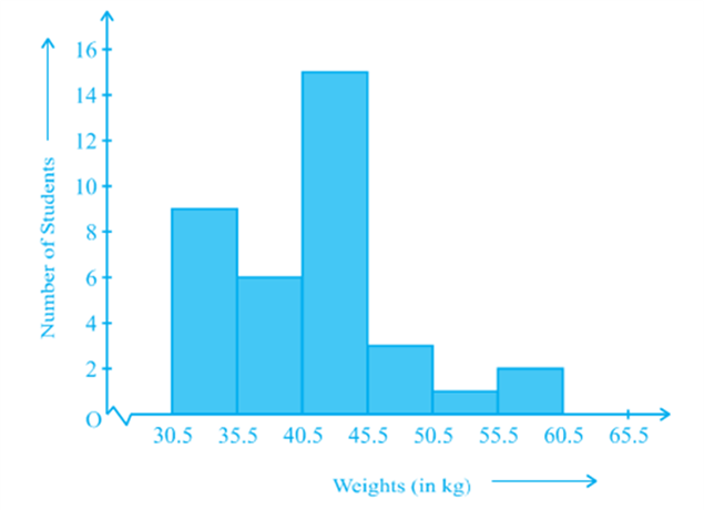
Observe that since there are no gaps in between consecutive rectangles, the resultant graph appears like a solid figure. This is called a histogram, which is a graphical representation of a grouped frequency distribution with continuous classes. Also, unlike a bar graph, the width of the bar plays a significant role in its construction.
Here, in fact, areas of the rectangles erected are proportional to the corresponding frequencies. However, since the widths of the rectangles are all equal, the lengths of the rectangles are proportional to the frequencies. That is why, we draw the lengths according to (iii) above.
(C) Frequency Polygon
There is yet another visual way of representing quantitative data and its frequencies. This is a polygon. To see what we mean, consider the histogram represented by Fig. Let us join the mid-points of the upper sides of the adjacent rectangles of this histogram by means of line segments. Let us call these mid-points B, C, D, E, F and G. When joined by line segments, we obtain the figure BCDEFG (see Fig.) To complete the polygon, we assume that there is a class interval with frequency zero before 30.5 - 35.5, and one after
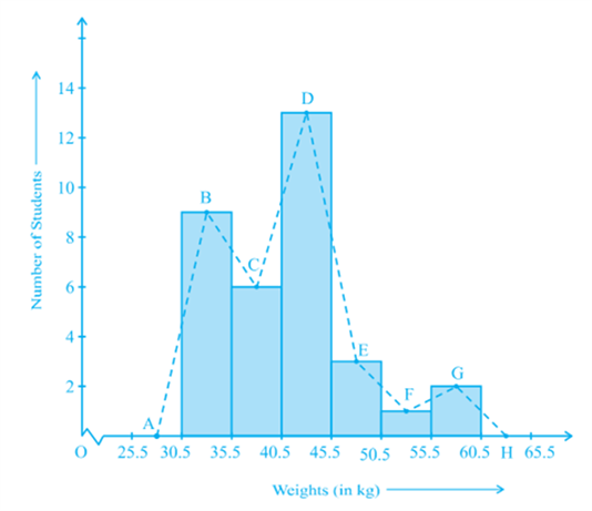
55.5 - 60.5, and their mid-points are A and H, respectively. ABCDEFGH is the frequency polygon corresponding to the data shown in Fig. We have shown this in Fig.
Although, there exists no class preceding the lowest class and no class succeeding the highest class, addition of the two class intervals with zero frequency enables us to make the area of the frequency polygon the same as the area of the histogram. Why is this so? (Hint: Use the properties of congruent triangles.)
Now, the question arises: how do we complete the polygon when there is no class preceding the first class? Let us consider such a situation.
Measures of Central Tendency
- Books Name
- Kaysons Academy Maths Foundation Book
- Publication
- Kaysons Publication
- Course
- JEE
- Subject
- Maths
Measures of Central Tendency
Earlier in this chapter, we represented the data in various forms through frequency distribution tables, bar graphs, histograms and frequency polygons. Now, the question arises if we always need to study all the data to ‘make sense’ of it, or if we can make out some important features of it by considering only certain representatives of the data. This is possible, by using measures of central tendency or averages.
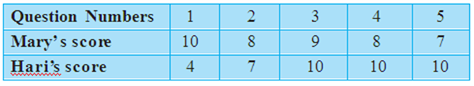
Consider a situation when two students Mary and Hari received their test copies. The test had five questions, each carrying ten marks. Their scores were as follows:
Upon getting the test copies, both of them found their average scores as follows:
![]()
![]()
Since Mary’s average score was more than Hari’s, Mary claimed to have performed better than Hari, but Hari did not agree. He arranged both their scores in ascending order and found out the middle score as given below:
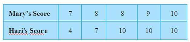
Hari said that since his middle-most score was 10, which was higher than Mary’s middle-most score, that is 8, his performance should be rated better.
But Mary was not convinced. To convince Mary, Hari tried out another strategy. He said he had scored 10 marks more often (3 times) as compared to Mary who scored 10 marks only once. So, his performance was better.
Now, to settle the dispute between Hari and Mary, let us see the three measures they adopted to make their point.
The average score that Mary found in the first case is the mean. The ‘middle’ score that Hari was using for his argument is the median. The most often scored mark that Hari used in his second strategy is the mode.
Now, let us first look at the mean in detail.
The mean (or average) of a number of observations is the sum of the values of all the observations divided by the total number of observations.
It is denoted by the symbol x , read as ‘x bar’.
Let us consider an example.
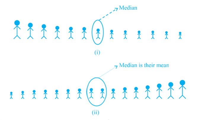
The median is that value of the given number of observations, which divides it into exactly two parts. So, when the data is arranged in ascending (or descending) order the median of ungrouped data is calculated as follows:
(i) When the number of observations (n) is odd, the median is the value of the ![]() observation. For example, if n = 13, the value of the
observation. For example, if n = 13, the value of the ![]() is., the 7th observation will be the median [see Fig (i)]
is., the 7th observation will be the median [see Fig (i)]
(ii) When the number of observations (n) is even, the median is the mean of the ![]() observations. For example, if n = 16, the mean of the value of the
observations. For example, if n = 16, the mean of the value of the ![]() observations, i.e., the mean of the values of the 8th and 9th observations will be the median [see Fig. (ii)].
observations, i.e., the mean of the values of the 8th and 9th observations will be the median [see Fig. (ii)].
The mode is that value of the observation with occurs most frequently, i.e., an observation with the maximum frequency is called the mode.
The ready made garment and shoe industries make great use of this measure of central tendency. Using the knowledge of mode, these industries decide which size of the product should be produced in large numbers.