 ABCD CLASSES
- Books Name
- ABCD CLASSES Mathematics Book
- Publication
- ABCD CLASSES
- Course
- CBSE Class 9
- Subject
- Mathmatics
Diagrammatic Presentation: Graphical Presentation of Data in Statistics
This kind of data presentation and analysis method says a lot with dramatically short amounts of time.
Diagrammatic Presentation has been divided into further categories:
Graphical Representation of Data
When a Diagrammatic presentation involves shapes like a bar or circle, we call that a Geometric Diagram. Examples of Geometric Diagrams. The grouped data of a collection of data can be represented using the graph as well. There are three ways by which we can represent the data in graphical form, which are;
- Bar Graph
- Histogram
- Frequency Polygons
Simple Bar Diagram
A simple Bar Diagram is composed of rectangular bars. All of these bars have the same width and are placed at an equal distance from each other. The bars are placed on the X-axis. The height or length of the bars is used as the means of measurement. So, on the Y-axis, you have the measurement relevant to the data.
Suppose, you want to present the run scored by each batsman in a game in the form of a bar chart. Mark the runs on the Y-axis - in ascending order from the bottom. So, the lowest scorer will be represented in the form of the smallest bar and the highest scorer in the form of the longest bar.
Multiple Bar Diagram
In many states of India, electric bills have bar diagrams showing the consumption in the last 5 months. Along with these bars, they also have bars that show the consumption that happened in the same months of the previous year. This kind of Bar Diagram is called a Multiple Bar Diagram.
Component Bar Diagram
Sometimes, a bar is divided into two or more parts. For example, if there is a Bar Diagram, the bars of which show the percentage of male voters who voted and who didn’t and the female voters who voted and who didn’t. Instead of creating separate bars for who did and who did not, you can divide one bar into who did and who did not.
Bar Graph
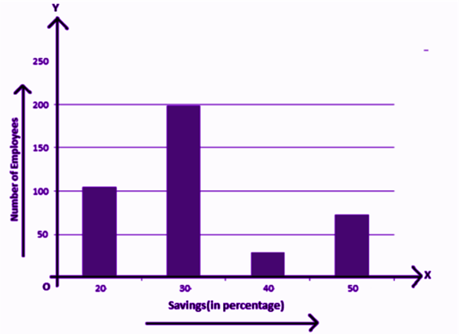
A bar graph gives a pictorial representation of data using vertical and horizontal rectangular bars, the length of the bars is proportional to the measure of data. Examples are:
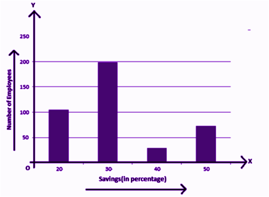
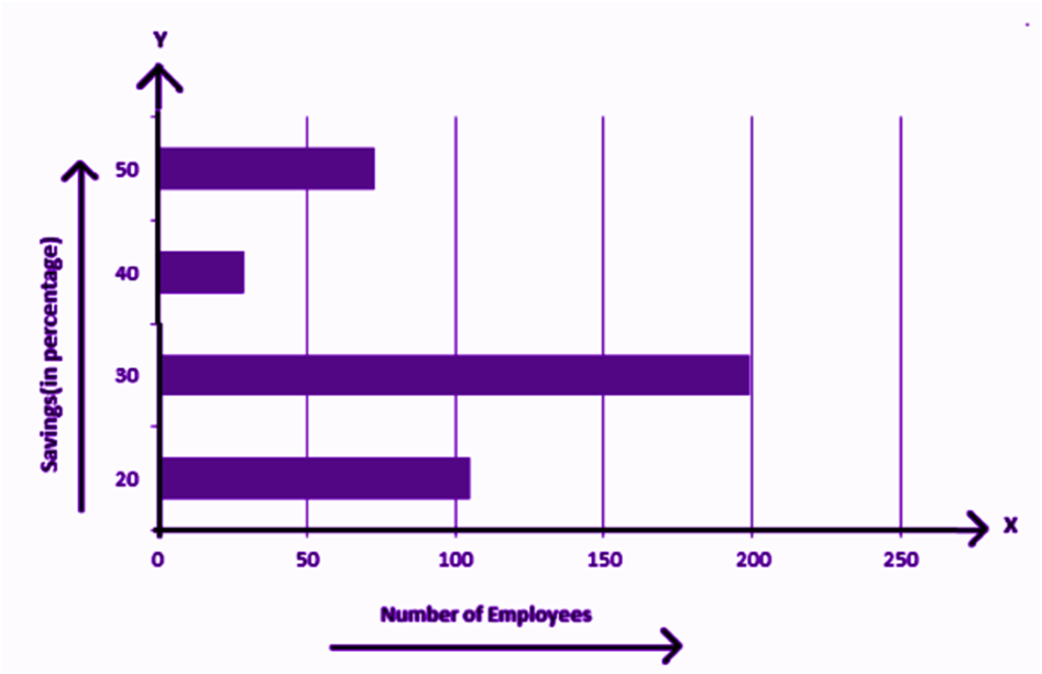
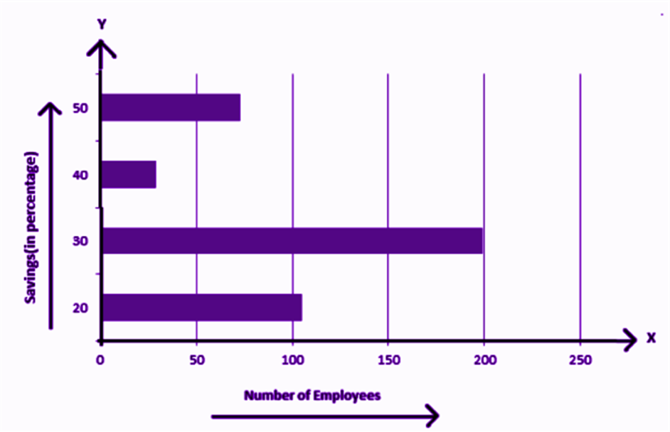
The above graph represents the data on the number of employees with respect to monthly salary savings. This is a vertical bar graph, which could also be represented horizontally, such as;
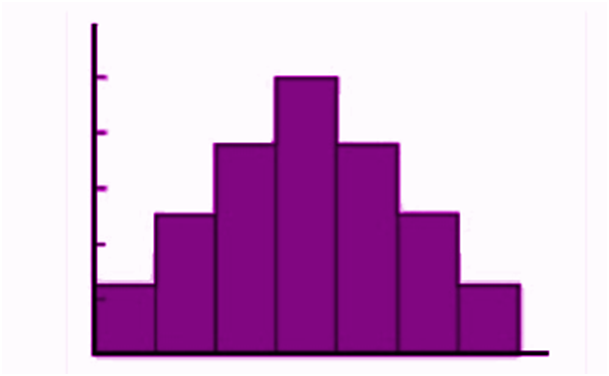
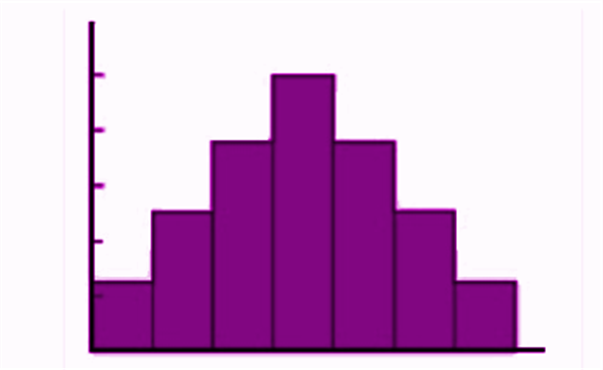
Histogram
A histogram can be defined as a set of rectangles with bases along with the intervals between class boundaries and with areas proportional to frequencies in the corresponding classes. Below is the general representation of a histogram. Where the grouped frequency of pens (from the above example) is written on the X-axis and the numbers of students are marked on the Y-axis. The data is presented in the form of bars.
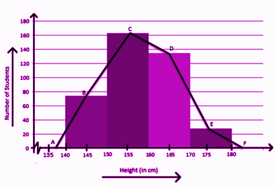
Frequency Polygon
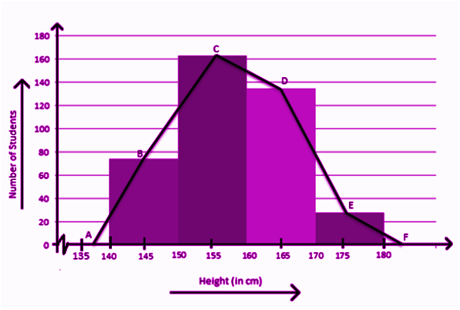
A frequency polygon is used to compare sets of data or to show a cumulative frequency distribution. It utilizes a line graph to express quantitative data. When you join the midpoints of the upper side of the rectangles in a histogram, you get a Frequency Polygon
Pie Chart
A pie chart is a chart where you divide a pie (a circle) into different parts based on the data. Each of the data is first transformed into a percentage and then that percentage figure is multiplied by 3.6 degrees. The result that you get is the angular degree of that corresponding data to be drawn in the pie chart. So, for example, you get 30 degrees as the result, on the pie chart you draw that angle from the center.
Frequency Diagram
Suppose you want to present data that shows how many students have 1 to 2 pens, how many have 3 to 5 pens, how many have 6 to 10 pens (grouped frequency) you do that with the help of a Frequency Diagram. A Frequency Diagram can be of many kinds:
Frequency Curve
When you draw a freehand line that passes through the points of the Frequency Polygon, you get a Frequency Curve.
Ogive
Suppose 2 students got 0-20 marks in maths, 5 students got 20-30 marks and 4 students got 30-50 marks in Maths. So how many students got less than 50 marks? Yes, 5+2=7. And how many students got more than 20 marks? 5+4=9. This type of more than and less than data are represented in the form of the ogive. The meeting point of the less than and more than line will give you the Median.
Arithmetic Line Graph
If you want to see the trend of Corona infection vs the number of recoveries from January 2020 to December 2020, you can do that in the form of an Arithmetic Line Graph. The months should be marked on the X-axis and the number of infections and recoveries are marked on the Y-axis. You can compare if the recovery is greater than the infection and if the recovery and infection are going at the same rate or not with the help of this Diagram.
Graphical Representation of Data
The grouped data of a collection of data can be represented using the graph as well. There are three ways by which we can represent the data in graphical form, which are;
- Bar Graph
- Histogram
- Frequency Polygons
Bar Graph
A bar-graph gives a pictorial representation of data using vertical and horizontal rectangular bars, the length of the bars are proportional to the measure of data. Examples are:
The above graph represents the data on the number of employees with respect to monthly salary savings. This is a vertical bar-graph, which could also be represented horizontally, such as;
Histogram
A histogram can be defined as a set of rectangles with bases along with the intervals between class boundaries and with areas proportional to frequencies in the corresponding classes. Below is the general representation of a histogram.
Frequency Polygon
A frequency polygon is used to compare sets of data or to show a cumulative frequency distribution. It utilises a line graph to express quantitative data.
Diagrammatic Presentation: Graphical Presentation of Data in Statistics
This kind of data presentation and analysis method says a lot with dramatically short amounts of time.
Diagrammatic Presentation has been divided into further categories:
- Geometric Diagram
When a Diagrammatic presentation involves shapes like a bar or circle, we call that a Geometric Diagram. Examples of Geometric Diagram
- Bar Diagram
Simple Bar Diagram
Simple Bar Diagram is composed of rectangular bars. All of these bars have the same width and are placed at an equal distance from each other. The bars are placed on the X-axis. The height or length of the bars is used as the means of measurement. So, on the Y-axis, you have the measurement relevant to the data.
Suppose, you want to present the run scored by each batsman in a game in the form of a bar chart. Mark the runs on the Y-axis - in ascending order from the bottom. So, the lowest scorer will be represented in the form of the smallest bar and the highest scorer in the form of the longest bar.
Multiple Bar Diagram
In many states of India, electric bills have bar diagrams showing the consumption in the last 5 months. Along with these bars, they also have bars that show the consumption that happened in the same months of the previous year. This kind of Bar Diagram is called Multiple Bar Diagrams.
Component Bar Diagram
Sometimes, a bar is divided into two or more parts. For example, if there is a Bar Diagram, the bars of which show the percentage of male voters who voted and who didn’t and the female voters who voted and who didn’t. Instead of creating separate bars for who did and who did not, you can divide one bar into who did and who did not.
Pie Chart
A pie chart is a chart where you divide a pie (a circle) into different parts based on the data. Each of the data is first transformed into a percentage and then that percentage figure is multiplied by 3.6 degrees. The result that you get is the angular degree of that corresponding data to be drawn in the pie chart. So, for example, you get 30 degrees as the result, on the pie chart you draw that angle from the center.
Frequency Diagram
Suppose you want to present data that shows how many students have 1 to 2 pens, how many have 3 to 5 pens, how many have 6 to 10 pens (grouped frequency) you do that with the help of a Frequency Diagram. A Frequency Diagram can be of many kinds:
Histogram
Where the grouped frequency of pens (from the above example) is written on the X-axis and the numbers of students are marked on the Y-axis. The data is presented in the form of bars.
Frequency Polygon
When you join the midpoints of the upper side of the rectangles in a histogram, you get a Frequency Polygon
Frequency Curve
When you draw a freehand line that passes through the points of the Frequency Polygon, you get a Frequency Curve.
Ogive
Suppose 2 students got 0-20 marks in maths, 5 students got 20-30 marks and 4 students got 30-50 marks in Maths. So how many students got less than 50 marks? Yes, 5+2=7. And how many students got more than 20 marks? 5+4=9. This type of more than and less than data are represented in the form of the ogive. The meeting point of the less than and more than line will give you the Median.
Arithmetic Line Graph
If you want to see the trend of Corona infection vs the number of recoveries from January 2020 to December 2020, you can do that in the form of an Arithmetic Line Graph. The months should be marked on the X-axis and the number of infections and recoveries are marked on the Y-axis. You can compare if the recovery is greater than the infection and if the recovery and infection are going at the same rate or not with the help of this Diagram.