 ABCD CLASSES
Collection of data
Collection of data
Collection of Data
Our world is becoming more and more information oriented. Every part of our life utilizes information in one form or another. So, it becomes essential for us to know how to extract meaningful information from such data. The extraction of meaningful information is studied in a branch of mathematics called Statistics.
This involves the study of the collection, analysis, interpretation, presentation, and organization of data. In other words, it is a mathematical discipline to collect, summarize data.
Types of data on the basis of the collection of data
Primary data: It is the data that is collected by a researcher from first-hand sources, using methods like surveys, interviews, or experiments. For example, The following data is collected by a student for his/her thesis for the research project.
• Height of 10 students in your class.
• Number of absentees in each day in your class for a month.
• Number of members in the families of your classmates.
• Height of 10 plants in or around your home.
Secondary data: It is the data that has already been collected by someone, and then it is updated, tailored or modified for a specific purpose.
For example, in a school, the class-teachers of respective sections record attendance on a daily basis.
This data recorded by the class- teacher is an example of primary data. On a given day, the principal of the school asks for the attendance of all students of each section, to collate the total number of students present in the school on a given day.
This data collected by the school principal is an example of secondary data.
Data Presenting for Clearer Reference
Imagine the statistical data without a definite presentation, will be burdensome! Data presentation is one of the important aspects of Statistics. Presenting the data helps the users to study and explain the statistics thoroughly. We are going to discuss this presentation of data and know-how information is laid down methodically.
In this context, we are going to present the topic - Presentation of Data which is to be referred to by the students and the same is to be studied in regard to the types of presentations of data.
Presentation of data
Presentation of Data
After collecting the data for a certain group, we have to now learn to present it. The presentation should be such that it should be meaningful, easily understood by everyone and the main features could be captured at a glance or by a single view. The important details should be highlighted properly. Here, to represent numerous data, we use a frequency distribution table, to condense the data into sub-groups. Let us see an example here.
Example: Suppose an exam was conducted for a class of 50 students. The marks obtained out of 100, by the students here are:
12, 23, 45, 55, 10, 33, 65, 78, 89, 22,
44, 55, 77, 88, 35, 65, 63, 61, 84, 89,
34, 27, 90, 65, 67, 45, 78, 98, 66, 77,
31, 41, 61, 68, 86, 34, 54, 59, 78, 89,
50, 29, 58, 63, 72, 87, 34, 65, 48, 91
Find how many students got more than 40 marks.
Solution: Let us arrange the data with respect to the marks obtained by the students.
|
Marks Obtained |
Number of Students |
|
0-20 |
2 |
|
21-40 |
10 |
|
41-60 |
11 |
|
61-80 |
17 |
|
81-100 |
10 |
Hence, from the above-grouped frequency distribution table, we can calculate the number of students who scored above 40 marks = 11+17+10 = 38
Presentation of Data and Information
Statistics is all about data. Presenting data effectively and efficiently is an art. You may have uncovered many truths that are complex and need long explanations while writing. This is where the importance of the presentation of data comes in. You have to present your findings in such a way that the readers can go through them quickly and understand each and every point that you wanted to showcase. As time progressed and new and complex research started happening, people realized the importance of the presentation of data to make sense of the findings.
Define Data Presentation
Data presentation is defined as the process of using various graphical formats to visually represent the relationship between two or more data sets so that an informed decision can be made based on them
Types of Data Presentation
Broadly speaking, there are three methods of data presentation:
- Textual
- Tabular
- Diagrammatic
Textual Ways of Presenting Data
Out of the different methods of data presentation, this is the simplest one. You just write your findings in a coherent manner and your job is done. The demerit of this method is that one has to read the whole text to get a clear picture. Yes, the introduction, summary, and conclusion can help condense the information.
Tabular Ways of Data Presentation and Analysis
To avoid the complexities involved in the textual way of data presentation, people use tables and charts to present data. In this method, data is presented in rows and columns - just like you see in a cricket match showing who made how many runs. Each row and column have an attribute (name, year, sex, age, and other things like these). It is against these attributes that data is written within a cell.
Graphical representation of data
Graphical Representation of Data
The grouped data of a collection of data can be represented using the graph as well. There are three ways by which we can represent the data in graphical form, which are;
- Bar Graph
- Histogram
- Frequency Polygons
Bar Graph
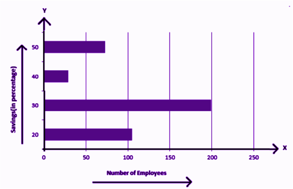
A bar-graph gives a pictorial representation of data using vertical and horizontal rectangular bars, the length of the bars are proportional to the measure of data. Examples are:
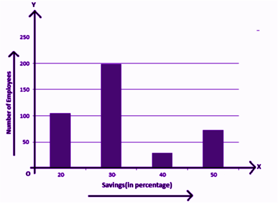
The above graph represents the data on the number of employees with respect to monthly salary savings. This is a vertical bar-graph, which could also be represented horizontally, such as;
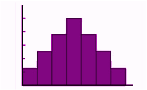
Histogram
A histogram can be defined as a set of rectangles with bases along with the intervals between class boundaries and with areas proportional to frequencies in the corresponding classes. Below is the general representation of a histogram.
Frequency Polygon
A frequency polygon is used to compare sets of data or to show a cumulative frequency distribution. It utilises a line graph to express quantitative data.
Diagrammatic Presentation: Graphical Presentation of Data in Statistics
This kind of data presentation and analysis method says a lot with dramatically short amounts of time.
Diagrammatic Presentation has been divided into further categories:
- Geometric Diagram
When a Diagrammatic presentation involves shapes like a bar or circle, we call that a Geometric Diagram. Examples of Geometric Diagram
- Bar Diagram
Simple Bar Diagram
Simple Bar Diagram is composed of rectangular bars. All of these bars have the same width and are placed at an equal distance from each other. The bars are placed on the X-axis. The height or length of the bars is used as the means of measurement. So, on the Y-axis, you have the measurement relevant to the data.
Suppose, you want to present the run scored by each batsman in a game in the form of a bar chart. Mark the runs on the Y-axis - in ascending order from the bottom. So, the lowest scorer will be represented in the form of the smallest bar and the highest scorer in the form of the longest bar.
Multiple Bar Diagram
In many states of India, electric bills have bar diagrams showing the consumption in the last 5 months. Along with these bars, they also have bars that show the consumption that happened in the same months of the previous year. This kind of Bar Diagram is called Multiple Bar Diagrams.
Component Bar Diagram
Sometimes, a bar is divided into two or more parts. For example, if there is a Bar Diagram, the bars of which show the percentage of male voters who voted and who didn’t and the female voters who voted and who didn’t. Instead of creating separate bars for who did and who did not, you can divide one bar into who did and who did not.
Pie Chart
A pie chart is a chart where you divide a pie (a circle) into different parts based on the data. Each of the data is first transformed into a percentage and then that percentage figure is multiplied by 3.6 degrees. The result that you get is the angular degree of that corresponding data to be drawn in the pie chart. So, for example, you get 30 degrees as the result, on the pie chart you draw that angle from the center.
Frequency Diagram
Suppose you want to present data that shows how many students have 1 to 2 pens, how many have 3 to 5 pens, how many have 6 to 10 pens (grouped frequency) you do that with the help of a Frequency Diagram. A Frequency Diagram can be of many kinds:
Histogram
Where the grouped frequency of pens (from the above example) is written on the X-axis and the numbers of students are marked on the Y-axis. The data is presented in the form of bars.
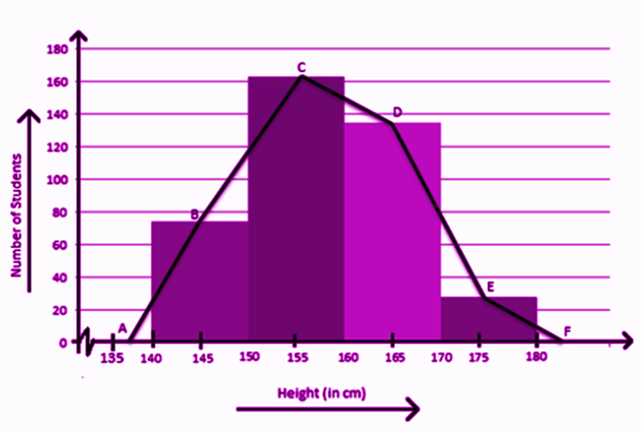
Frequency Polygon
When you join the midpoints of the upper side of the rectangles in a histogram, you get a Frequency Polygon
Frequency Curve
When you draw a freehand line that passes through the points of the Frequency Polygon, you get a Frequency Curve.
Ogive
Suppose 2 students got 0-20 marks in maths, 5 students got 20-30 marks and 4 students got 30-50 marks in Maths. So how many students got less than 50 marks? Yes, 5+2=7. And how many students got more than 20 marks? 5+4=9. This type of more than and less than data are represented in the form of the ogive. The meeting point of the less than and more than line will give you the Median.
Arithmetic Line Graph
If you want to see the trend of Corona infection vs the number of recoveries from January 2020 to December 2020, you can do that in the form of an Arithmetic Line Graph. The months should be marked on the X-axis and the number of infections and recoveries are marked on the Y-axis. You can compare if the recovery is greater than the infection and if the recovery and infection are going at the same rate or not with the help of this Diagram.
Measures of Central Tendency
Measures of central tendency
There are majorly three measures of central tendency:
- Mean
- Median
- Mode
Mean: Mean is the average of the given set of data.
x̄=∑ x/n
Where n is the number of observations
Median: The median is that value which divides the given number of observations into exactly two parts. First, the data set has to be arranged in an order, either ascending or descending. There are again two conditions here:
- If the number of observations is odd, then;
Median = [(n+1)/2]th observation or term
- If the number of observations is even, then the median will be mean of (n/2)th term and (n/2+1)th term.
Mode: The mode represents the frequently occurring value in the dataset.
Example: Find the mean, median and mode of the following data set.
2,3,6,7,4,5,3,8,3,9
Solution: Mean is the average of the given data;
x̄ = (2+3+6+7+4+5+3+8+3+9)/10 = 50/10 = 5
Now, to find the median, we need to arrange the data in ascending order.
2,3,3,3,4,5,6,7,8,9
Since, here the number of observations is even, therefore, the median will be the mean of the two middle terms.
Median = (4+5)/2 = 9/2 = 4.5
Mode = 3, since 3 is repeated here maximum number of times.
Practice Questions
Q.1: Give one example of a condition in which:
(i) the mean is a proper measure of central tendency.
(ii) the mean is not a proper measure of central tendency but the median is a proper measure of central tendency.
Q.2: Find the mean, median mode of 14, 25, 14, 28, 18, 17, 18, 14, 23, 22, 14, 18.
Q.3: The relative humidity (in %) of a certain city for a month of 30 days was as follows:
98.1 98.6 99.2 90.3 86.5 95.3 92.9 96.3 94.2 95.1 89.2 92.3 97.1 93.5 92.7 95.1 97.2 93.3 95.2 97.3 96.2 92.1 84.9 90.2 95.7 98.3 97.3 96.1 92.1 89
(i) Write a grouped frequency distribution table with classes 90 – 95, 80 – 85, etc.
(ii) Which month or season do you think this data is about?
(iii) What is the range of this data?
(iv) Represent the data set using bar-graph and histogram