 ReginaTagebücher
- Books Name
- class 8 th Mathematics Book
- Publication
- ReginaTagebücher
- Course
- CBSE Class 8
- Subject
- Mathmatics
Data Handling
Frequency tables, Histograms and Pie charts
Recalling different representations of data
Data is a collection of information.
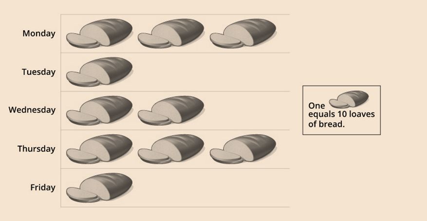
A pictograph - It is a pictorial representation of data.
Let us look at the pictograph of the loaves of bread sold by a bakery in a week.
A bar graph - It is a representation of data using bars of uniform length.
Let us look at the bar graph of subject-wise marks scored by Vivian.
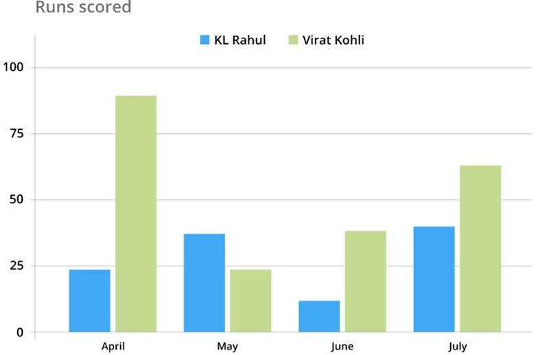
A double bar graph - It is used to represent the comparison between two sets of data.
Let us look at the monthly report of runs scored by KL Rahul and Virat Kohli.
Organizing data
The data we receive is raw; that is, it is unorganized data.
To make the unorganized data understandable, we tabulate the data received in tabular columns or bar graphs.
Sections of a tabular column:
We tabulate data under the columns Variable/Class, Tally marks and Frequency.
Variable/Class:
It consists of the unique type of entries in a set of unorganized data. In numerical variables, it is recommended to arrange the entries in ascending or descending orders. Ordering of data enhances the understandability of the tabular column formed.
Tally marks:
Vertical line(s) marked against each entry under the column 'Variable/Class'. Tally marks tells us the number of times each entry repeats itself in that set of data.
Frequency:
The numerical representation of the number of times an entry repeats itself in that set of data.
Let us look at a sample tabular column and analyze it in detail.
The colours of pencils Vinod has:
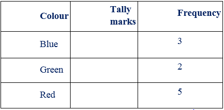
The 'Variable' is the different colours of pencils that Vinod has from the table given above.
So, Vinod has blue, green, red pencils. So, these 3 colours are the three unique entries.
The number of pencils of each colour is given by using both tally marks and numerical representation
Grouped and ungrouped data
When the data collected is a whole or exact measurement, it is ungrouped data or discrete data.
Example:
1. The number of books in a library.
2. The number of bikes in a showroom.
Grouped or continuous data
A grouped or continuous data is any value between a minimum value and a maximum value. In other words, continuous data will have values from a particular range. This type of data can be tabulated in the form of a frequency distribution table.
Example:
1. The age group of cricketers in India.
2. The number of floors in government buildings
The difference between the highest value and the smallest value in a set of data is the range.
Example:Consider the following set of data 2, 7, 8, 6, 10, 5, 6, 8, 2.
The frequency distribution table will look like the following:
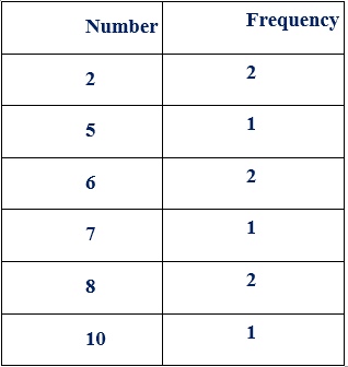
The data is entered in the ascending order of entries followed by the number of times it gets repeated.
From the column 'Number', we know that the highest value is 10, and the smallest value is 2.
Range=Highest value−Smallest value
=10−2 =8
Therefore, the range of the given set of data is 8.
Classes and class intervals
Class: While depicting more extensive data, data of common tendencies could fall into a group, and those groups are called classes. A set of data can have any number of classes.
Example: Let us consider the data of the heights of people opting for the adventure sport.
The different classes could be heights between 150cm to 155cm, 156cm to 160cm, and 160cm to 165cm.
Class interval (C.I.): Classes will always have an upper limit and a lower limit. Class interval is the difference between the upper limit and the lower limit. The upper limit is the class's highest value, and the lower limit is the class's lowest value.
Class interval=Upper limit−Lower limit
Here, Upper limit =45 and Lower limit =32.
Thus, Class interval=Upper limit−Lower limit
=45−32 =7
Bars with a difference
Histograms
Histograms are one way of graphically representing a grouped data; that is, histograms represent continuous data.
Histograms are made of a set of rectangles. X-axis will have the different ranges of continuous data, and Y-axis will have the frequency.
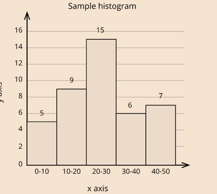
What is the difference between a bar graph and a histogram?
Bar graphs are used to represent discontinuous data. In other words, there are gaps between two frequency rectangles in a bar graph, while histograms are used to represent continuous data, and there are no gaps between two frequency rectangles.
Construction of a histogram
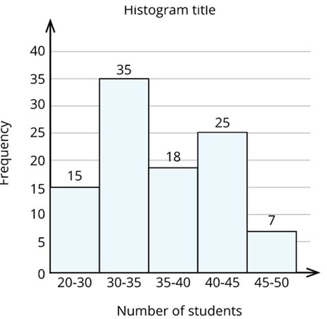
Problem: A private organization surveyed hundred schools in Chennai. The organization collected the average number of kindergarten children in each classroom.
The data table looks like this:
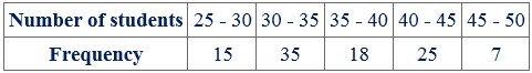
Now, let us try to construct a histogram.
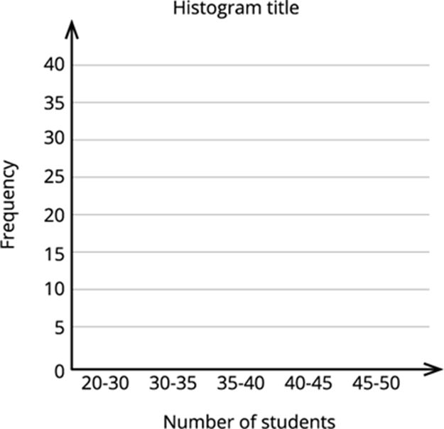
Step 1: Set and mark the units for X-axis and Y-axis.
Here, the axes will look like this:
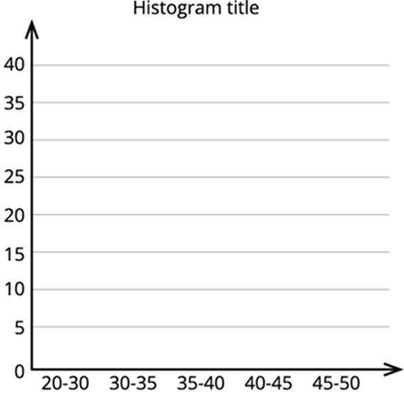
Step 2: Now mark the class intervals (Number of students) along the X-axis and the frequency along the Y-axis.
Step 3: Now, construct rectangles with class intervals (number of students) as the base and the frequency as the height.
Circle graphs or pie charts
A Pie chart is a circular graphical representation of data. It got its name from the famous American food 'pie'.
Pie charts are wholesome representations of the entire set of given data and are made up of different components that set up the data.
Construction of pie charts
Since pie charts are circular, they are formed using a 360∘ angle.
Pie charts, as a whole, constitute 100%.
Each component on the pie chart occupy some parts of the entire pie chart. The parts that each of the components occupy are represented as percentages.
The volume of each of the components on a pie chart is found using the formulae given below.
The central angle of the component=Value of the componentTotal value×360∘
If the components are expressed as percentages, then:
The central angle of the component=Percentage value of the component100×360∘
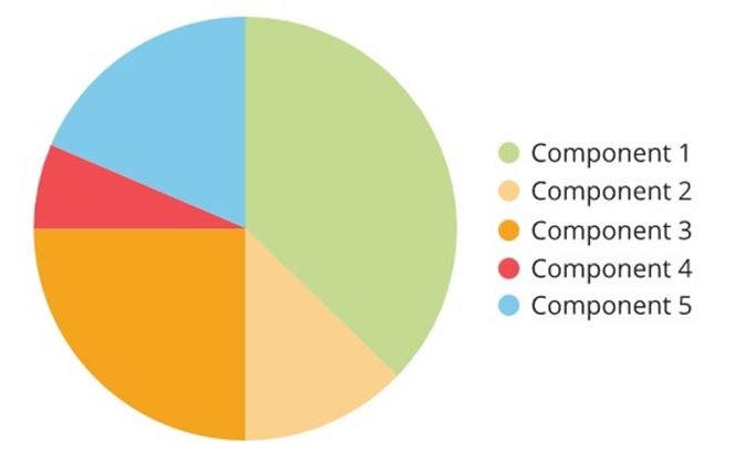
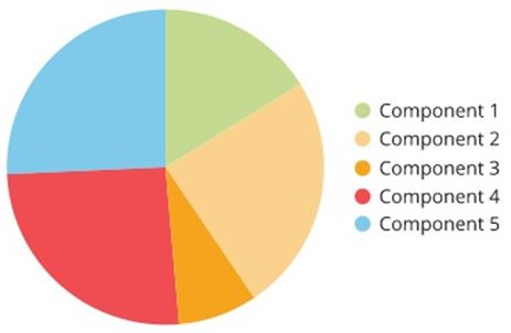
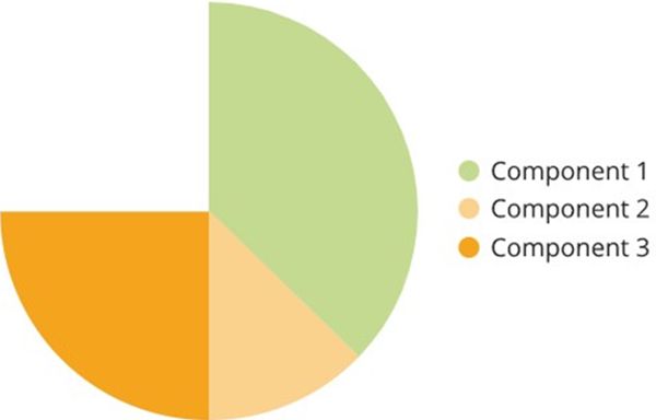
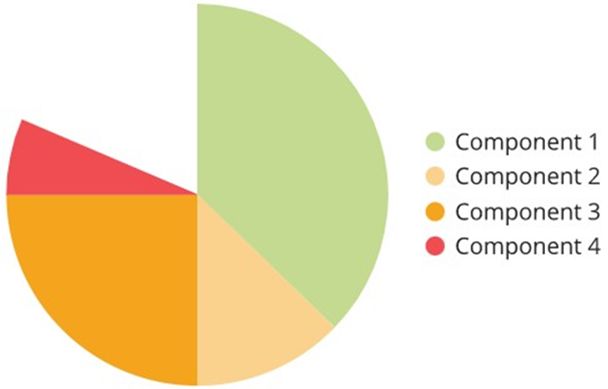
Now, let us try to construct a pie chart for the given values.
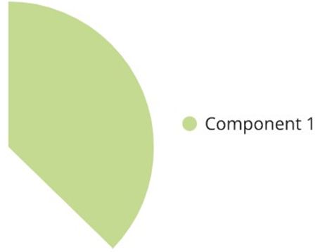
Component 1=15000
Component 2=5000
Component 3=10000
Component 4=2500
Component 5=7500
First, find the portion each of the individual components occupy on the pie chart.
Since, values are considered in this example, use the following formula:
The central angle of the component=Value of the componentTotal value×360∘
Here, the total value is the sum of all the values of the individual components.
Total value = Value of component 1+ Value of component 2+ Value of component 3+ Value of component 4+ Value of component 5
=15000+5000+10000+2500+7500 =40000
The central angle of the component 1=1500040000×360∘ =135∘
Now, the centre of the pie chart as radius, construct an angle of 135∘.
The central angle of the component 2=500040000×360∘=45∘
Now, the centre of the pie chart as radius, construct an angle of 45∘.

The central angle of the component 3=1000040000×360∘ =90∘
Now, the centre of the pie chart as radius, construct an angle of 90∘.
The central angle of the component 4=250040000×360∘ =22.5∘
Now, the centre of the pie chart as radius, construct an angle of 22.5∘.
The central angle of the component 5=750040000×360∘ =67.5∘
Now, the centre of the pie chart as radius, construct an angle of 67.5∘ to complete the pie chart.